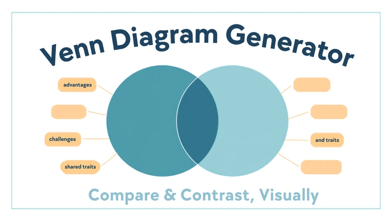
Drag, resize, and relabel 2 to 5 overlapping circles to sort similarities and differences before writing — downloads as a JPEG image.
Comparison Is Spatial Before It's Verbal
A compare-and-contrast assignment sounds simple and often reads as a scattered list once students actually sit down to write it — a similarity mentioned once and never returned to, two points repeated in different sections without anyone noticing. The thinking usually isn't the problem; describing an overlap in a straight line of sentences is harder than seeing it. The Venn Diagram Generator makes that overlap visible first, turning comparison into something closer to sorting than writing, before a single sentence needs to exist.
What's Actually on the Canvas
Between two and five circles, each independently draggable, resizable, recolorable, and relabeled with a click (labels are capped at 40 characters). Items — short labels representing a trait or fact — can be dragged anywhere on the canvas, including directly into an overlap, and moved again at any point. Undo and redo cover the last 60 actions, and the whole layout autosaves to the browser being used, restoring automatically if the page reloads — though that save doesn't follow to a different device or browser. A finished diagram downloads as a single JPEG image, ready to drop into a document or a slide.
What It Doesn't Check
The tool has no logic that validates whether an item dropped into an overlap actually belongs there — it renders exactly where it's placed, with no correctness checking behind it. That's worth knowing going in: a student working quickly can drag something into the wrong overlap without any warning, so a finished diagram is worth a second look before it's finalized, checking that anything placed in a shared space genuinely applies to both circles and nothing unique got dropped in by mistake.
Where This Gets Used
Before drafting an essay comparing two characters or two texts, sorting traits into a two-circle diagram first gives the essay its actual structure — the overlap becomes the shared-points paragraph, and each outer section becomes what's unique to one side. A science class classifying organisms by shared traits can use three or more circles to show which characteristics appear in one group, two, or all three, which is easier to point at than to explain aloud. A review session before a test can lay out several easily-confused concepts side by side, showing exactly where they overlap and where they diverge. And because it's easy to project and edit live, a whole class can build one diagram together, with disagreements about where something belongs becoming a real discussion instead of a quiet correction.
Keeping It Readable
A diagram works best with a manageable number of items per circle — fifteen or twenty small labels crammed into one section becomes hard to read even if every placement is technically correct. Prioritizing the strongest points over capturing everything a class brainstormed tends to produce a more useful diagram than a completely exhaustive one.
Choosing Three Circles on Purpose
Circle-based diagrams have a real limit past three circles: with four or five, there's no way to draw every possible overlap combination without the shape becoming unreadable — that's true of circle geometry generally, not a gap in this particular tool. What four or five circles give instead is a clear visual comparison of several sets at once, arranged so each circle overlaps meaningfully with its neighbors, which covers what most four- or five-way classroom comparisons actually need. When an assignment genuinely requires showing every combination — which item belongs to sets A and C but not B, for instance — three circles is the more honest choice; two or three keep every overlap region distinct and fully readable, which is the layout most people picture when they think "Venn diagram" in the first place.
How This Fits Into A Real Workflow
- Decide how many circles the comparison actually needs. Two for a straightforward comparison, three when every overlap combination matters, four or five only when a looser "several sets at once" view is enough.
- Set the diagram's title first. It sits at the top of the canvas and prints as part of the final exported image, so it's worth setting before dragging items around rather than adding as an afterthought.
- Label each circle and pick a color for it. Any color works, not just a fixed set of swatches — useful for matching a diagram's colors to a subject's existing color coding, like a textbook's category key.
- Drag items into place as the class or student identifies them. Items can be repositioned at any point, and undo/redo covers the last 60 actions, so an early misplacement is never a reason to start over.
- Review before finalizing. Since the tool doesn't check whether an item belongs where it's been dropped, a second look catches a rushed placement before it ships in the final image.
- Download as a JPEG. Ready to drop into an essay draft, a slide, or a printed handout.
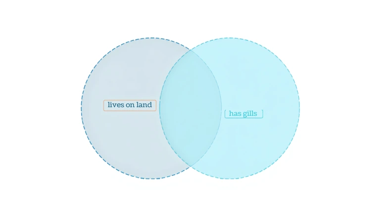
A finished two-circle diagram, comparing frogs and fish for a classification lesson, might sort out like this:
- Frogs only: lungs as adults, can live on land, four legs
- Overlap: cold-blooded, lay eggs in water, no fur or feathers
- Fish only: gills their whole life, fins, live in water permanently
That's the structure an essay comparing two characters or two historical events would follow the same way — items unique to one side in the outer sections, genuine shared traits in the middle.
Privacy
Diagrams built around books, historical events, or scientific concepts don't involve any student data. The one case worth a moment's thought is a diagram built as an icebreaker comparing students' own interests or traits — in that case, keep the content to what students volunteer themselves and avoid anything that could embarrass someone if the diagram is displayed to the class.
FAQ
How many circles can a diagram have?
Between two and five.
Does the tool check whether an item is placed in the right section?
No — it places items exactly where they're dropped with no correctness checking. Review the finished layout before relying on it.
Can a diagram be saved and come back to later?
It autosaves in the browser it was built in and reloads automatically, but that save doesn't carry over to a different device or browser.
What format does a finished diagram download as?
A single JPEG image.
Is this useful outside English and writing classes?
Yes — science classification, history comparisons, and vocabulary distinctions all use the same overlapping-circle structure as a literature comparison.
Seeing the Relationship First
Most students can reason through a comparison once they can see it laid out, and struggle when asked to describe the same relationship from a blank page. Sorting into circles first — whether for an essay, a classification lesson, or a pre-test review — puts that seeing-it step before the writing, not after.
 This article is about
Venn Diagram Generator for Classrooms, Study & Projects
Open the tool
This article is about
Venn Diagram Generator for Classrooms, Study & Projects
Open the tool